The Analyst: A sign of the times - rating this season's best and worst 'give us your shirt' signs

- Paul Okey
- 10 January 2022
You can't move for signs asking for players' shirts at games nowadays. But much like the quality of play on the pitch, the standards can vary hugely. Planet Sport picks out some of the best and worst.
If the 2021/22 season is remembered for anything it will be the complete domination of 'give us your shirt' signs.
Once a sweet appeal from an innocent youngster, they are now veering into legalised begging territory with all kinds of tricks being pulled to try to obtain a shirt.
Not that we can't occasionally appreciate the efforts that fans (and not always youngsters) put in to get their hands on a sweat-soaked jersey.
Here, Planet Sport rates the some of the best and worst from this season.
Mane, Mane, Mane

A nice sold start this one, with the Liverpool fan using an eye-catching two-colour palette.
A consistent typeface and straight to the point. The lack of a question mark loses it a point, however. There's no excuse for grammar errors, not even on 'give us your shirt' signs.
Rating: 7/10
I have a d-Raheem

This young Hungary fan looked apprehensive but he needn't be. It's a focused sign, easy to read and is polite, too.
It could have possibly done without both exclamation marks but it was a pretty raucous atmosphere so the shouting can be excused.
Rating: 7
Sheet effort

Inconsistent font sizes and a switch from upper case to lower case midway through, this is a far less focused effort.
No shirt and years of sleeping on a bare mattress for his troubles.
Rating: 4
S**t effort

Rating: 2
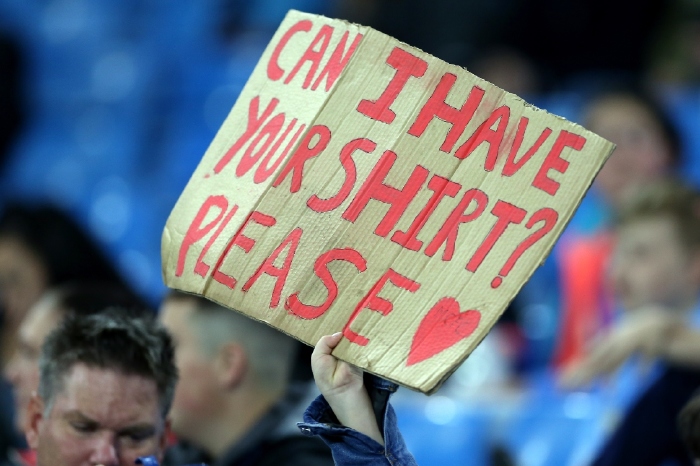
Pulling a fast one

Rating: 3
Desperate but not serious
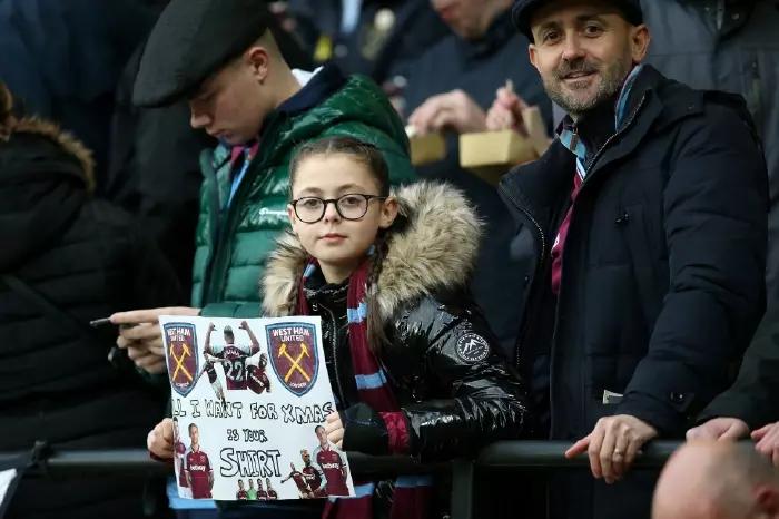
Ah, why put all your eggs in one basket? The generic approach might just work and the heart is a nice touch.
Yeah, it was Scott Carson's shirt I really wanted.
Rating: 3
England expects
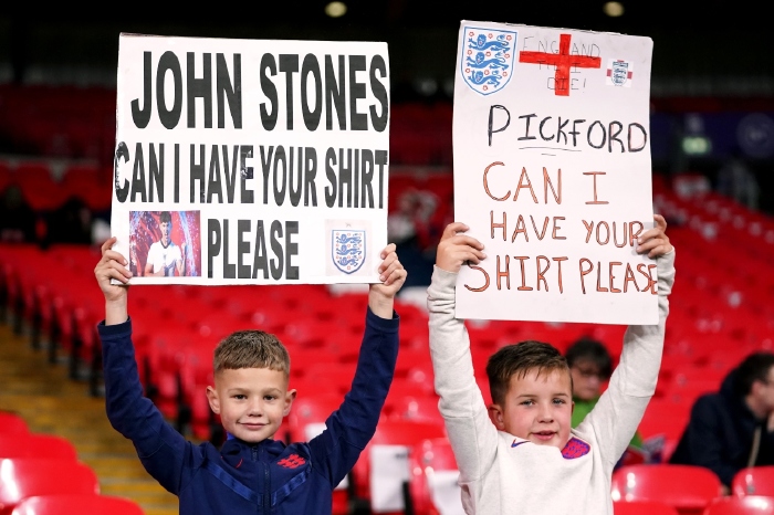
We all had that mate, didn't we? The one whose parents did their homework for them and always filled their Panini sticker book. Well, it's payback time.
Rating: 2 (for the parent-produced one), 7 for the one on the right
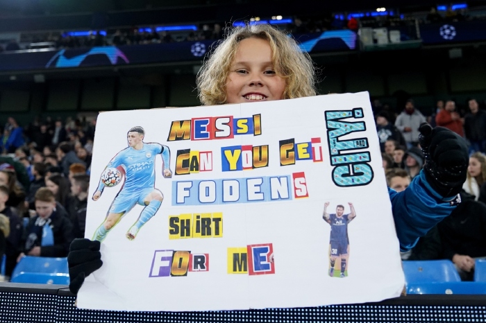
Che audacity

Goes straight in with the player name, which combines well with the Scotland blue and easy-to-read format.
An extra mark for the use of diacretic (although ironically Planet Sport doesn't use them), instantly lost by the space between 'please' and the question mark.
Rating: 7
Cutting comments
The shirt sign is not really a place for jokes but fair play for trying. A career in ransom demand notes awaits.
Rating: 6
Not so nice one, Son

This is what happens when you put all your efforts into the colour printing; you're forced to scour the neighbourhead bins for cardboard deemed too tatty to place in the recycling box.
And maybe write the words and then put the pics on after next time eh?
Rating: 1
Super effort
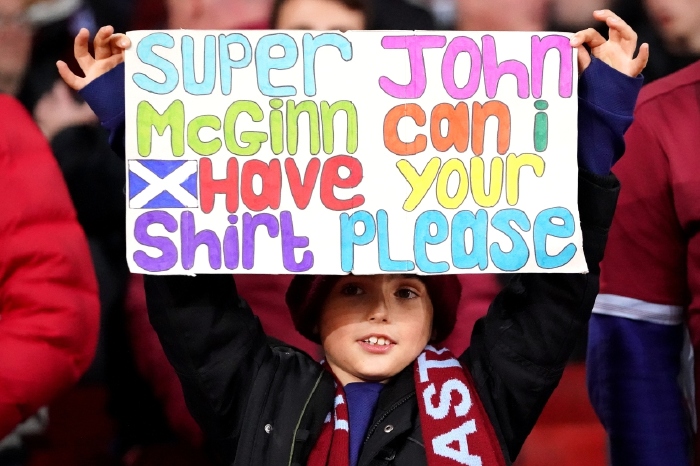
I'm liking this one a lot. It's a fun font, the colours are eyecatching and it's a good use of the space provided.
The random capitals and lack of a question mark let it down sightly. Nonetheless it's decent effort and deserving of the Aston Villa midfielder's attention, if not his shirt.
Rating: 8
Dale or no dale?

Proof that it's not just sweaty Premier League players' shirts that are in demand, with this sign for Rochdale midfielder Liam Kelly.
The 23 is unnecessary unless Kelly has a range of numbered shirts, while the exclamation mark adds a little menace to the request, something not helped by the accompanying pose.
Rating: 5 (9 if I were to bump into the one on the left in the street)
Crash and Burn-ley
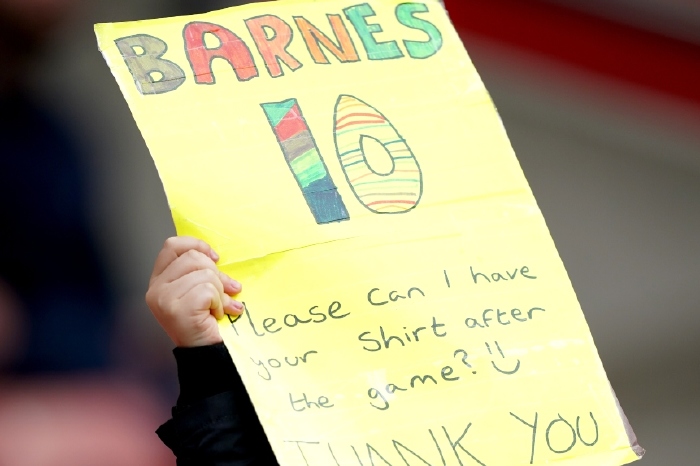
The range of colours on the Barnes are a nice touch and the pattern on the 10 brings thoughts of Easter. However, the rest is too wordy, too small and rushed.
Rating: 5
Good Kop

There's quite a lot not to like on this but the end result is rather charming. Sloping fonts, an excess of information and a complicated red/green lettering shouldn't work but does. With so much effort going into trying to get players' shirts, it shows that sometimes a sign doesn't have to be perfect to hit the right note.
Rating: 9