From Hot! to What? We rate the best and worst shirts of 2021/22

- Johnnie Victoria
- 16 July 2021
Inter Milan and Barcelona may be among Europe's elite but when it comes to kit design they are lagging way behind the likes of Hull City and Atletico Mineiro.
Here at Planet Sport we do love a good kit launch, from the cinematic masterpieces to the simple 'oh yeah, this is our kit this year'.
Here are the best, worst and 'who are TeamViewer' jerseys we've seen so far.
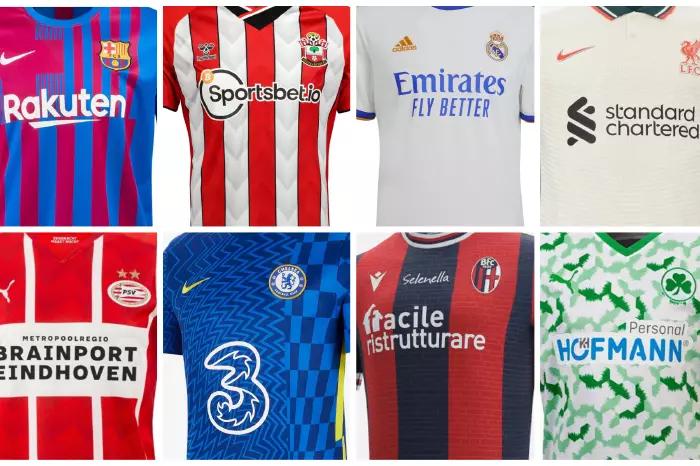
Good: Liverpool (Away)
What a way to start off this list. Well done Liverpool.
Gorgeous. Classy. Elegant. Absolutely stunning. Instant classic. Enough said.
📣 𝐎𝐮𝐭 𝐧𝐨𝐰 𝐢𝐧-𝐬𝐭𝐨𝐫𝐞 𝐚𝐧𝐝 𝐨𝐧𝐥𝐢𝐧𝐞 🤩
— Liverpool FC (@LFC) July 15, 2021
This season’s @nikefootball kits are made from 100% recycled polyester from recycled plastic bottles ♻️
Shop now ➡️ https://t.co/8qtORb3PIJ pic.twitter.com/tQfcniPuSd
Bad: Barcelona (Home)
Who is this? Like seriously, who is this? Because this isn't the Barcelona look.
It's the Barcelona colours and it's Barcelona players in the kit. But that's not a Barcelona-looking shirt.
#MoreThan a jersey 💙❤️ pic.twitter.com/9izkiXTHEw
— FC Barcelona (@FCBarcelona) June 15, 2021
Good: Forward Maddison FC (Beach/ Club)
The USL League One team have become known for their unique alternate kits, and this year is no different.
For this season, they have come up with a fully reversible jersey that they have dubbed the Beach/Club kit. One side is a flamboyant pink that is beach ready, the other is a slick black with a hot pink flamingo pattern, ready for a night out.
This is a jersey like no other. 🏖️♣️
— Forward Madison FC (@ForwardMSNFC) June 24, 2021
This is the Forward Madison Beach/Club Kit.
🛍️ Get yours: https://t.co/HYRowqfYk5 pic.twitter.com/V5083kS3lu
Bad: Inter (Home)
A new-look badge that has no identity. Black and blue snakeskin shirt. Are they mad?
No grazie, Inter! No grazie!
👕 | NEW SHIRT
— Inter 🏆🇮🇹 (@Inter_en) July 15, 2021
The New Skin of Milano.
Get yours now 👉 https://t.co/Nd5X7dOOuO#TheNewSkinOfMilano #IMInter #IMMilano pic.twitter.com/OtpYoS2T3X
Good: Atletico Mineiro (2021 special)
Atletico Mineiro wanted a design that celebrated the team's 113 years of existence and turned to their supporters for help, resulting in this beauty.
This is, quite honestly, the best kit we have ever witnessed. We are not exaggerating.
Atlético Mineiro organised a competition with their supporters to design the club's new kit.
— Football Tweet (@Football__Tweet) July 14, 2021
.. and this was the result. 🇧🇷🔥 pic.twitter.com/lVn5QblSu7
Bad: Greuther Furth (Home)
Why are there weird, poorly drawn green bats all over this?
Neue @Bundesliga_DE Saison, neues @PUMA Trikot, neues Hofmann Personal Hauptsponsor-Logo: wir sind gerüstet!
— SPVGG GREUTHER FÜRTH (@kleeblattfuerth) July 2, 2021
Unsere Hauptsponsorin Ingrid Hofmann hat heute unserer Mannschaft das neue Bundesliga-Heimtrikot offiziell überreicht. 🙏#kleeblatthttps://t.co/Lox05hUQNZ
Good: Southampton (Home & third)
Saints' new kit supplier, Hummel, decided to go with a DNA theme, taking aspects of the club's history and what makes them Southampton to come up with these kits.
Hummel has become shirt manufacturer for a number of clubs this season and what they are putting out this year is straight out of top bins.
Shoutout to Everton and Coventry City for their Hummel-made new drops too.
Loading: 2021/22 🔋
— Southampton FC (@SouthamptonFC) May 28, 2021
© @Prowsey16 pic.twitter.com/URD0tnZ3hF
Anyone else copped already? 🤩
— Southampton FC (@SouthamptonFC) July 9, 2021
🖤 #saintsfc pic.twitter.com/O5MrYCVd2h
Bad: Chelsea (Home)
There's a reason why Chelsea didn't wear this in the Champions League final, and it's not just because they had already suffered an FA Cup final defeat in it.
Our new @nikefootball Home Kit... 🤤🔥
— Chelsea FC (@ChelseaFC) May 13, 2021
Inspired by the '60s Op-Art movement made famous in London 🎨 The yellow trim, coupled with a more vibrant blue, injects a youthful feel that we can't get enough of. 👊 pic.twitter.com/znNIRc5NtP
Good: Hull City (Away)
Unbelievably nice kit from the Tigers. Whoever designed this deserves the biggest of raises.
Only the Atletico Mineiro shirt has had as much universal love as Hull have had for this cracking piece of kit.
😍 𝐀 𝐭𝐡𝐢𝐧𝐠 𝐨𝐟 𝐛𝐞𝐚𝐮𝐭𝐲 😍#hcafc | #theTigers pic.twitter.com/ikkgePKon8
— Hull City (@HullCity) July 9, 2021
Bad: Preston North End (Away)
💚 Introducing our 𝟮𝟬𝟮𝟭/𝟮𝟮 𝗮𝘄𝗮𝘆 𝗸𝗶𝘁... 💛
— Preston North End FC (@pnefc) July 7, 2021
Available for pre-order now!
➡️ https://t.co/lfc5S8SHhM#pnefc pic.twitter.com/6m2uAMCa1Z
Good and bad: Manchester United (Home)
Paying homage to their past, you get real prime George Best vibes from this one. Manchester United have done right.
We just can't get past their new TeamViewer sponsor. It's putting us right off. It's not even that big or bad-looking. It just doesn't seem right on it. Sharp would look, er, far sharper.
Ready to represent 🔴#MUFC x @adidasfootball
— Manchester United (@ManUtd) July 16, 2021